These days it's hard to conceive of life without the internet. We have come a long way since the early days of the internet as a hobbyist's retreat full of text bulletin boards and personal "web logs". People now rely on the internet to pay bills, shop for necessities and even earn an income. The world is at your fingertips... if you can use a mouse... and see the screen... and hear the audio.
For many many people this is not as simple as it sounds. One in four adults in the United States has a disability. This means that a huge number of Americans are limited in the way they can interact with a computer, and might use it differently than your average user.
The good news is that humans are clever and adaptible and we have created all kinds of fantastic assistive technology tools like screen readers, pointing implements and voice control that help make the digital world accessible to everyone. And they usually work great out of the box as long as the websites they visit follow a few simple best practices.

You don't have to be a screen reader master or have a team of professional accessibility testers to improve the accessibility of your website. Here are five easy steps you can take to make your website accessible without needing to be an accessibility expert:
1. Add alt text to your images
What happens when a non-sighted user encounters an image on a website?
If the content is a news article, the image might be a picture illustrating the scene. If its a how to listicle, it might be a diagram illustrating a particularly complicated step.
Screen readers aren't smart enough to be able to describe a picture on their own, so they rely on the information that the webpage gives them about that image. For example, if our webpage is displaying an article about penguins and we want to show an image of the penguin we're talking about, but we only include the bare image tag on the page, such as
<img src="847227.jpg" />
all the screen reader user will hear is:
"image. eight four seven two two seven dot jpg."
This means the screen reader user is missing out on some of the information the page has to offer.
The good news is this issue is extremely easy to correct. Introducing the humble alt tag!
<img src="847227.jpg" alt="A penguin standing on a beach" />
With the simple addition of this tag, the screen reader will switch from reading out the meaningless image file name, to reading:
"image. A penguin standing on a beach."
With this one line addition, screen reader users now have all the same information that visual readers do.
Adding alt tags to your images helps sighted users too! We've all had the experience of being in a place with such bad cell service that the images on the webpage we're trying to load time out. Alt text to the rescue! Most browsers will display alt text if they're unable to load the image, so users with bad cell signal can still get all the information the page has to offer, even if they're not able to download the images.
This kind of outcome - a design that's intended to help disabled users helps non-disabled users as well - is known as the "curb cut effect".
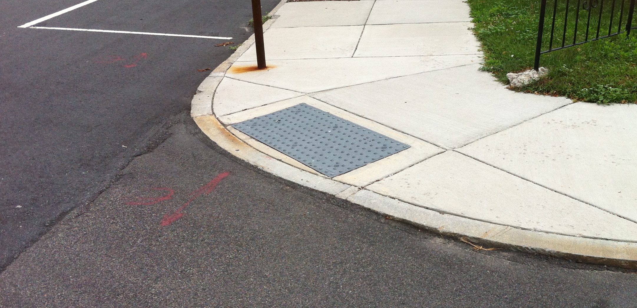
A curb cut is a depression in the sidewalk curb that leads down to the street. Curb cuts were designed to make public streets accessible to wheelchair users, but today everyone benefits. Curb cuts are useful to moms with strollers, delivery drivers, people with temporary injuries and anyone who has ever walked down the street with their eyes locked on their phone.
Many web accessibility fixes are curb cuts for regular users. We'll see many more examples in this article.
2. Fix your low contrast fonts
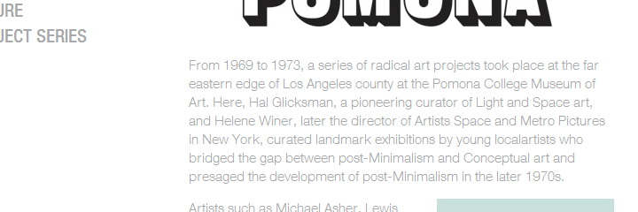
In the early and mid 2010's, lots of websites underwent redesigns to make them more aesthetically beautiful and "web 2.0":
Light font weights and delicate low-contrast accent colors were all the rage. The instinct was understandable - the web was shifting from a smaller, technical minded audience to a more general audience who businesses who businesses knew they could draw in with more attractive experiences.
Aesthetics are important but they aren't the ultimate goal of design. The most beautiful website is useless if the user can't read and interpret its content. And often poor readability doesn't get noticed during the design process. We developers and designers don't read the text the same way a visitor might.
Humans have done a lot of scientific research on what makes text on a background readable vs. not readable, and the W3C has actually published a document called Web Content Accessibility Guidelines (WCAG) 2.1 that covers successful contrast guidelines. They boil readable text down into a single mathematical formula: the contrast ratio.
The contrast ratio explains the difference between the lightest color brightness and the darkest color brightness in a given range. It’s the relative luminance of each color. This article is meant to be purely practical, so I'm not going to go into the details of the math here, but you can read this great CSS Tricks article for more information.
What we care about here is that the minimum acceptable ratio for readablility is 4.5:1 for most body text and 3:1 for larger text.
If your eyes just glazed over, don't worry. There are automated tools that can do this for you. The simplest way to look up the ratio between two colors is with the WebAIM contrast checker: https://webaim.org/resources/contrastchecker/
For the working web developer, I suggest the WCAG Contrast Checker extension for Chrome and Firefox.
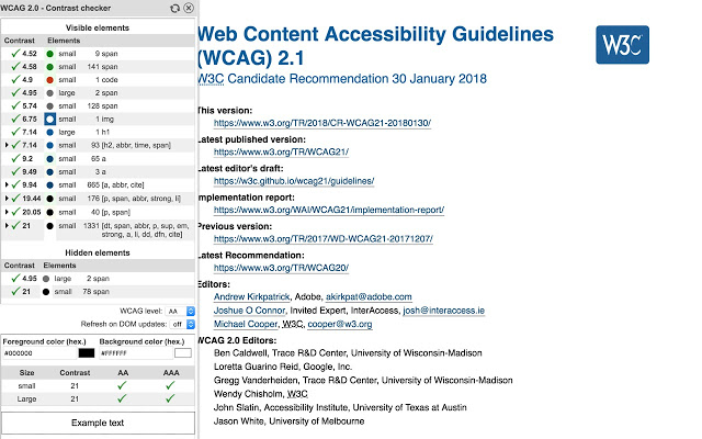
It will automatically analyze your entire webpage for contrast problems and suggest fixes.
Just like alt text, better contrast is a curb cut. More readable color schemes mean less strain on the eyes, and more readable websites for users who might be trying to read your website on their phone while they're outside in bright sunlight.
3. Make clickable elements keyboard-friendly
Are the only interactive elements on your website <a>, <button> and <video> tags? Great, you're done! You can go onto the next section, because HTML5 handles keyboard accessibility by default.
If you've ever put an onClick on a <div> tag, however, read on...
There are a lot of reasons why someone would choose to use a keyboard rather than a mouse to interact with your website. The most obvious case is that non-sighted users can't see where the cursor is, but many people have physical limitations that make mouse precision difficult or impossible. Many more people are perfectly capable of using a mouse, but can't or don't want to for a variety of reasons. Maybe their mouse is just broken and they're trying to use your ecommerce website to buy a new one!
The simplest way for a keyboard user to navigate through a website is with the tab key. Pressing tab will shift the browser focus to the next interactive element on the page. Once the focus is on the element the user is interested in, they can hit the enter or space key to interact. You've probably seen this before when you accidentally bumped tab and one of the links on the page reacted by looking like this:
As I mentioned at the beginning of the section, this works by default for HTML5 elements that are meant to be interactive. The problem is that websites do a lot more nowadays than present text and links.
Go to your website right now and hit the tab key. Is the element you expect highlighted? Keep pressing tab until you cycle through the entire page. Did every element you know is clickable get highlighted? If not, that means that your keyboard-only users are unable to interact with all parts of your website.
The good news is that for most simple websites, the solution is elementary: USE. SEMANTIC. TAGS.
Replace
<div>Play video</div>
with
<button>Play video</button>
Things the user clicks to make something on the page are buttons, so call them buttons in your HTML.
Replace
<div onclick="window.location = 'https://new.url'">Click here to go</div>
with
<a href="https://new.url">Click here to go</a>
Things the user clicks to navigate from the current page to another page are links, so call them links in your HTML.
"BUT ZACH!" you say, "I'm maintaing a legacy widget that renders a grid of clickable images and if I change them to buttons the 10,000 lines of spaghetti CSS I inherited break the whole page due to a browser bug!"
Ok. I get it. I'm also a working web developer. You should always try to use semantic HTML tags wherever possible, but if you can't for whatever reason, at least put tabindex on interactive elements so keyboard users can get to them.
4. Add accessibility audit tools to your build
No one can be an expert in everything. While I always encourage web developers to understand accessibility basic, I also understand that there's an infinite amount of interesting things to learn about computers, and its unrealistic to expect everyone to be an expert in every topic.
But, as with everything else in computing, you don't have to be an expert to benefit from the learnings of other programmers and computer scientists. You can approach it in the most programmer way possible: automate it!
There are a huge variety of excellent accessibility testing tools out there, and its almost guaranteed you can find one to fit your workflow.
I suggest that every software project have two levels of automated accessibility testing: a static code analyzer and an end-to-end system tester.
Static Code Analysis
Are you working with a modern JavaScript framework and using ESLint? Great, you're one npm install away from automated a11y code auditing. There are ESLint accessibility audit plugins for JSX and Vue.
There's a ton of great accessibility linting tools out there, here's a few I found in a 5 minute search:
Look around and be creative. If you don't see one for your specific use case, consider writing a plugin for your linter and putting it out there!
End to End System Tester
Only so many issues can be caught by statically reading code, so its also important to have a tool that loads your website in a browser and audits the actual page for issues.
I strongly suggest Axe. Its a fantastic accessibility testing toolkit that is already built into a lot of existing integration test solutions.
There's a Cypress integration, a Lighthouse integration, a Ghostjs integration and even a Py Selenium integration. Here's the full list of integrations, I can pretty much guarantee that at least one of these will work for your use case.
I use the Cypress integration and love it.
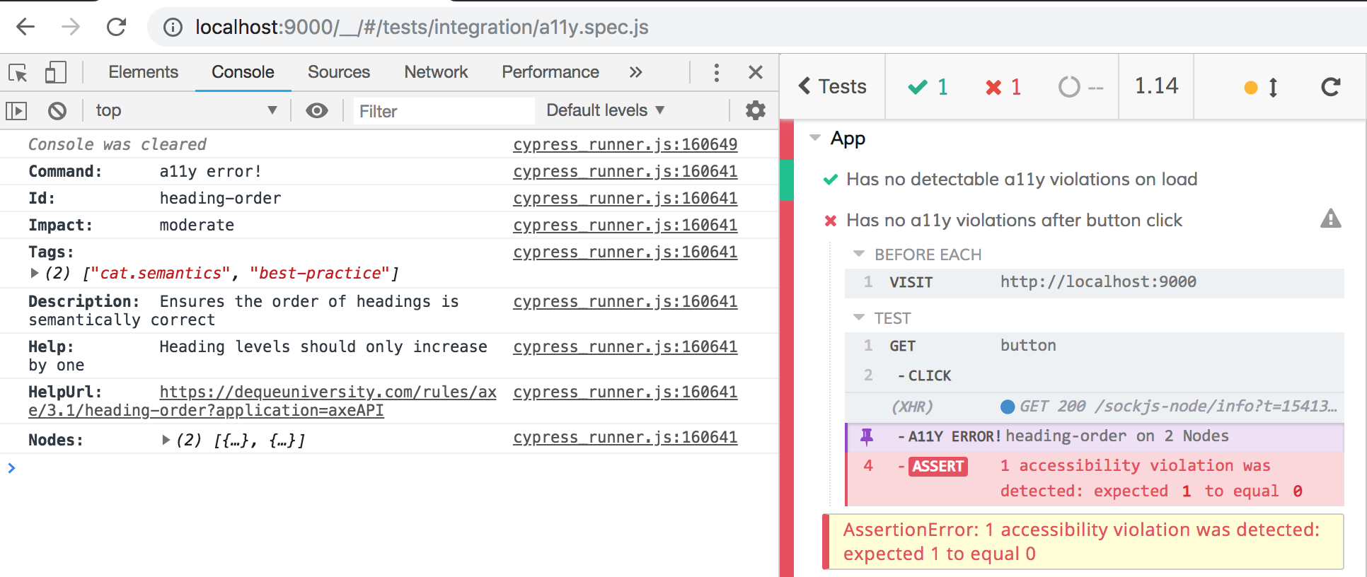
It gives you a clear printout of what went wrong, with a rule name ("heading-order in the screenshot) that's easily searchible, so you can look up what the fix is without being an accessibility expert.
5. Learn the basics of assistive technologies and empathize with your users
“The more you watch users carefully and listen to them articulate their intentions, motivations, and thought processes, the more you realize that their individual reactions to Web pages are based on so many variables that attempts to describe users in terms of one-dimensional likes and dislikes are futile and counter-productive. Good design, on the other hand, takes this complexity into account.”
― Steve Krug, Don't Make Me Think: A Common Sense Approach to Web Usability
We're all in this industry because we love using the web so much we wanted to be a part of shaping the experience. Apply that enthusiasm on behalf of your users. Ask them questions and listen to what they say. Seek diverse perspectives. Try interacting with your sites the way they do.
I have spent the past year gaining fluency in Apple's VoiceOver and it has been an exciting and humbling experience. I'm now able to articulate accessibility pain points in design discussions because I myself have felt those pain points. I know what frustrates screen reader users the most beacuse I've felt those very frustrations.
The internet is also full of passionate assistive technology users sharing their experiences with technology. Listen and reach out!
Here's one of the talks that got me excited about accessibility in the beginning. Hopefully it inspires you as well.